Sarum Studio, week 6
I started writing this post over a week ago, but time has been against me in the final days of summer school and I didn’t get around to publishing it. So, a little delayed, here is some work from weeks 5 and 6 at Sarum Studio.
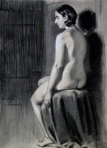
The figure study was a two week project. The work itself looks better than the photo for some reason that I can’t quite figure out. There’s a lot that I don’t really like about this study though. Apart from the lumpen-ness of the figure itself, which I think comes from a lack of finesse in finding rhythms through the pose (and making the arm a little too thick), I find it tonally quite flat. Partly this is due to working on grey paper. While this gives the opportunity to heighten some areas with white chalk, the flow of light in this instance just didn’t allow for enough extra punch. I also struggled with what to do with the background. I didn’t want to be literal, but did want to convey a sense of space. I don’t think what I ended up doing works. I do like the treatment of the shadow edge though.
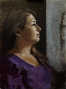
The portrait is a fairly quick study done in 3 shots. I didn’t sight-size this one as it is on a smaller canvas board than usual and (to be honest) I wanted to concentrate on paint application and have a bit of a break from the more mechanical aspects of measuring.
This sounds awful, but I really didn’t care that much about this painting. As a result though, I relaxed and had fun. The portrait itself is a good likeness, and this time I tried to place the model within some kind of context by suggesting the drawing taking place to the other side of her. I also included her headphones with a long swoop of the brush – which I enjoyed.
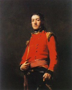
While I don’t even begin to compare my work to that of Henry Raeburn, I was mindful of his bold, carefully filtered brushwork while I painted the model’s clothing. I took a flat of decent size and zigzagged a shadow pattern to indicate the folds around the arm. The particular painting I had in mind was Raeburn’s ‘Sir Duncan Campbell of Barcaldine’ (left). Just look at the simplicity of shapes and tone, and how striking and effective it is. Wonderful.

